
使用HEXO搭建博客后, 总会多多少少碰到一些不符合使用预期的情况,比如Gitment评论系统异常、网站内容加载异常等等; 下面罗列了一些可能的问题和注意事项等;
评论系统注意事项:
Gitment:使用过程中, 如果发现在页面点击"Initialize Comments" 发现无效, 可以打开控制台查看network 选项卡XHR, 如果有域名"imsun.net" 相关的链接访问异常, 可以直接在新页面打开异常链接, 可能是chrome认为存在跨域限制,cookie缺失, ssl链接不安全等问题造成的. 新页面确认通过就ok了
切换统计PV、UV系统的一些注意事项 (更新:2022-11-14 21:35:20)
之前一直使用页面主题自带的"不蒜子"统计,简洁方便; 可最近可能是该服务持续非可用状态,导致不得不切换到一些相对新而且稳定的统计系统。
vercount 进入选型, 该系统自称可以一键切换,而且可以自动根据页面地址和"不蒜子"同步, 但目前切换使用下来, 基本么有同步成功的情况
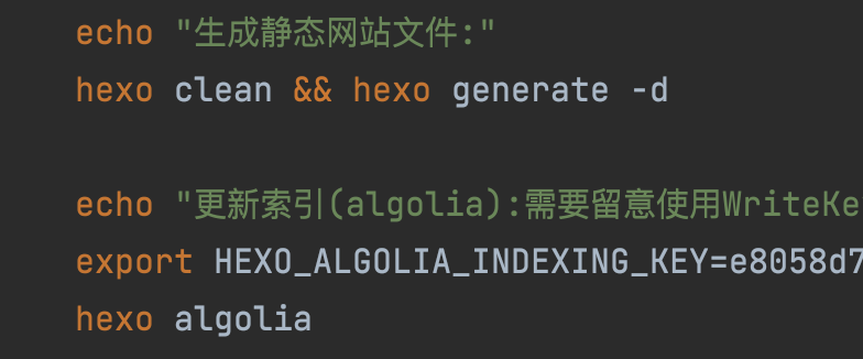
hexo使用hexo-algolia插件,做全文搜索支持时一些留意点(更新: 2025-10-19 00:54:05)
在本地的配置文件中,需要明确初始推送到algolia网站时,需要使用的是WriteKey(即该key具有读写属性),而在页面配置key的使用需要使用ReadKey(即该key只需要具有读属性即可)。可以参考我这种方式, 即 _config.yml中配置的是正常的支持只读属性的key,而在部署脚本中动态写入一个支持读写属性的key
hexo 的模板中添加网易云播放插件,怎么搞呢? 可以这样试试,利用hexo框架原生的helper插件实现
由于hexo本身是静态全局,由于网易云的外站播放插件iframe不同的平台(移动端or桌面端)链接不一样,无法写死,需要根据平台动态调整,所以利用hexo的helper来实现
1, 首先在项目根目录的 scripts/ 或者 themes/<themename>/scripts/ 创建一个helper.js的文件,并添加如下相关内容
1
2
3
4
5
6
7
8
9
10
11
12
13
14
15
16
17
18
19
20
21
22
23
24
25
26
27
28
29
30
31
32
33
34
35
36
37
38
39
40
41
42;
/**
* Hexo Helper: 生成用于判断设备并加载不同 iframe 的 JavaScript 代码。
* @param {string} mobileSrc - 移动端 iframe 的 src URL
* @param {string} desktopSrc - 桌面端 iframe 的 src URL
* @param {string} containerId - 放置 iframe 的容器 ID (例如: 'iframe-container')
* @returns {string} 包含判断逻辑的 \<script> 标签
*/
hexo.extend.helper.register('load_device_specific_iframe', function(mobileSrc, desktopSrc, containerId) {
// 确保所有参数都存在
if (!mobileSrc || !desktopSrc || !containerId) {
hexo.log.warn('load_device_specific_iframe Helper 缺少必要的参数 (mobileSrc, desktopSrc, containerId)');
return '';
}
// 客户端 JavaScript 代码
const jsCode = `
(function() {
// 检查 User-Agent 是否包含常见的移动设备关键词
var isMobile = /Android|webOS|iPhone|iPad|iPod|BlackBerry|IEMobile|Opera Mini/i.test(navigator.userAgent);
// 也可以使用更现代的 Max-Width 判断 (通常结合 CSS Media Query 使用)
// var isMobile = window.matchMedia("(max-width: 768px)").matches;
var src = isMobile ? '${mobileSrc}' : '${desktopSrc}';
var container = document.getElementById('${containerId}');
if (container) {
var iframe = document.createElement('iframe');
iframe.src = src;
iframe.frameBorder = '0'; // 可选:设置边框样式
iframe.setAttribute('allowfullscreen', ''); // 可选:允许全屏,也可以设置其他的iframe属性
iframe.style.width = '100%';
iframe.style.height = '600px'; // 根据需要设置高度
container.appendChild(iframe);
}
})();
`;
// 返回包含 JavaScript 代码的 <script> 标签
return `<script>${jsCode}</script>`;
});2,在你需要添加播放器iframe的Hexo 模板(例如 layout/post.ejs 或 layout/page.ejs)中,设置页面元素,比如:
1
2
3
4
5
6
7<div id="my-device-specific-iframe-container">
</div>
<%- load_device_specific_iframe(
'https://m.example.com/mobile-iframe-content', // 移动端 iframe URL
'https://www.example.com/desktop-iframe-content', // 桌面端 iframe URL
'my-device-specific-iframe-container' // 容器 ID
) %>
hexo 文档中也要添加类似网易云的播放插件,那又怎么搞呢? 利用hexo的tag插件实现
由于hexo本身是静态全局,由于网易云的外站播放插件iframe不同的平台(移动端or桌面端)链接不一样,无法写死,需要根据平台动态调整,所以利用hexo的tag来实现
1,同上,首先在项目根目录的 scripts/ or themes/
/scripts/ 创建一个tag.js的文件,并添加如下相关内容 1
2
3
4
5
6
7
8
9
10
11
12
13
14
15
16
17
18
19
20
21
22
23
24
25
26
27
28
29
30
31
32
33
34
35
36
37
38
39
40
41
42
43
44
45
46
47
48
49
50
51
52
53
54
55
56
57
58
59
60
61
62
63
64
65
66/**
* 注册一个 Hexo Tag 插件,用于根据设备插入不同的 Iframe
* * 使用方法:
* {% dynamic_iframe "iframe的宽度" "iframe的高度" "PC端链接" "移动端链接" %}
* * 例如:
* {% dynamic_iframe "100%" "600px" "https://www.example.com/pc_embed" "https://m.example.com/mobile_embed" %}
*/
function dynamicIframe(args) {
// 1. 解析参数
// args 数组通常是:["宽度", "高度", "PC端链接", "移动端链接"]
const width = args[0] || '100%'
const height = args[1] || '400px'
const pcSrc = args[2] || 'about:blank' // 默认值
const mobileSrc = args[3] || 'about:blank' // 默认值
// 2. 生成唯一的容器 ID
const containerId =
'dynamic-iframe-container-' + Math.random().toString(36).substring(2, 9)
// 3. 返回包含 HTML 和 JavaScript 的字符串
// 注意:我们通过 JS 来决定 iframe 的 src,以实现动态加载
return `
<div id="${containerId}" class="dynamic-iframe-wrapper" style="width: ${width}; height: ${height}; overflow: hidden; position: relative;">
<div style="text-align: center; padding: 20px; border: 1px dashed #ccc;">正在根据您的设备加载内容...</div>
</div>
<script>
(function() {
let container = document.getElementById('${containerId}');
if (!container) return;
// 清空占位符内容
container.innerHTML = '';
// 核心判断逻辑
let userAgent = navigator.userAgent.toLowerCase();
// 判定移动端(包括主流手机、平板)
let isMobile = /android|webos|iphone|ipod|blackberry|iemobile|opera mini/i.test(userAgent);
// 增强平板判定,例如 iPad (包含 'macintosh' 且支持多点触控)
if (/ipad|tablet/.test(userAgent) || (userAgent.includes('macintosh') && navigator.maxTouchPoints && navigator.maxTouchPoints > 2)) {
isMobile = true;
}
// 确定要加载的 iframe URL
const targetSrc = isMobile ? '${mobileSrc}' : '${pcSrc}';
// 创建 iframe 元素
let iframe = document.createElement('iframe');
iframe.src = targetSrc;
iframe.style.width = '100%';
iframe.style.height = '100%';
iframe.frameBorder = '0'; // 移除边框
iframe.scrolling = 'auto';
// 插入 iframe 到容器中
container.appendChild(iframe);
})();
</script>
`
}
hexo.extend.tag.register('dynamic_iframe', dynamicIframe, {
ends: false,
async: true,
})
2,在你需要添加播放器的文档中(例如: source/_posts/xxx.md),相应位置插入
1
2
3
xxxx 上下文
{% dynamic_iframe "100%" "430px" "https://pcurl.xxxx" "https://mobileurl.xxx" %}
hexo文档中如果添加的本地站内静态html文件,如何在新的标签页打开呢?
hexo本身markdown文档的内置渲染器hexo-renderer-marked默认是支持配置,如果是站外链接默认会加上 target=“_blank”,rel="noopener noreferrer"等标签的,但如果使用内置的原生html文件等,就无法支持; 如果直接修改默认渲染器会影响全局渲染逻辑;权衡之下还是同样利用hexo内置的tag插件实现’
1,编写插件;在项目根目录的 scripts/ or themes/
/scripts/ 创建一个xxxtag.js的文件,并添加如下相关内容 1
2
3
4hexo.extend.tag.register('link_new', function(args) {
const [href, text] = args;
return `<a href="${href}" target="_blank" rel="noopener noreferrer">${text}</a>`;
});2,在相应的md文档中相关位置插入所需的本地链接
1
2
3
xxxx 上下文
{% link_new https://example.com 链接文本 %}